Candlesticks on a price chart are not just visual tools.
They reflect the clash between buying and selling pressure, as well as the psychology of market participants.
Japanese candlestick charts present these dynamics in the most intuitive way, playing a key role in helping traders interpret market behavior.
Even a single candlestick can reveal which force dominated during a given period,
and when multiple candles are combined, they provide insight into market direction and potential reversals.
🔹 Basic Structure of a Candlestick
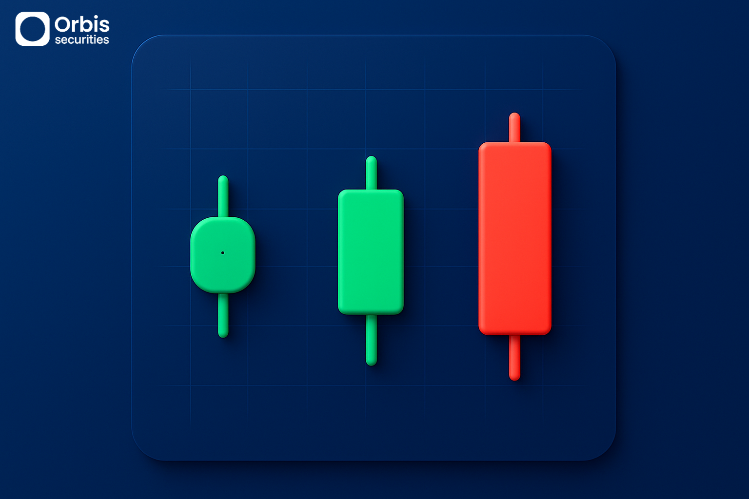
A candlestick summarizes the open, high, low, and close prices within a specific time period into a single visual form.
The area between the open and close is called the body, which allows traders to quickly identify whether the price moved up or down.
If the close is higher than the open, it indicates a bullish move;
if the close is lower, it indicates a bearish move.
The lines extending above and below the body are called wicks (or shadows).
They show how far the price moved during that period and help estimate the strength of buying and selling pressure based on their length.
Ultimately, a single candlestick is not just price data—it is a condensed representation of the balance of forces in the market during that time.
🔹 What Candlestick Patterns Represent
Individual candlesticks carry meaning on their own, but they become more significant when interpreted within their context and trend.
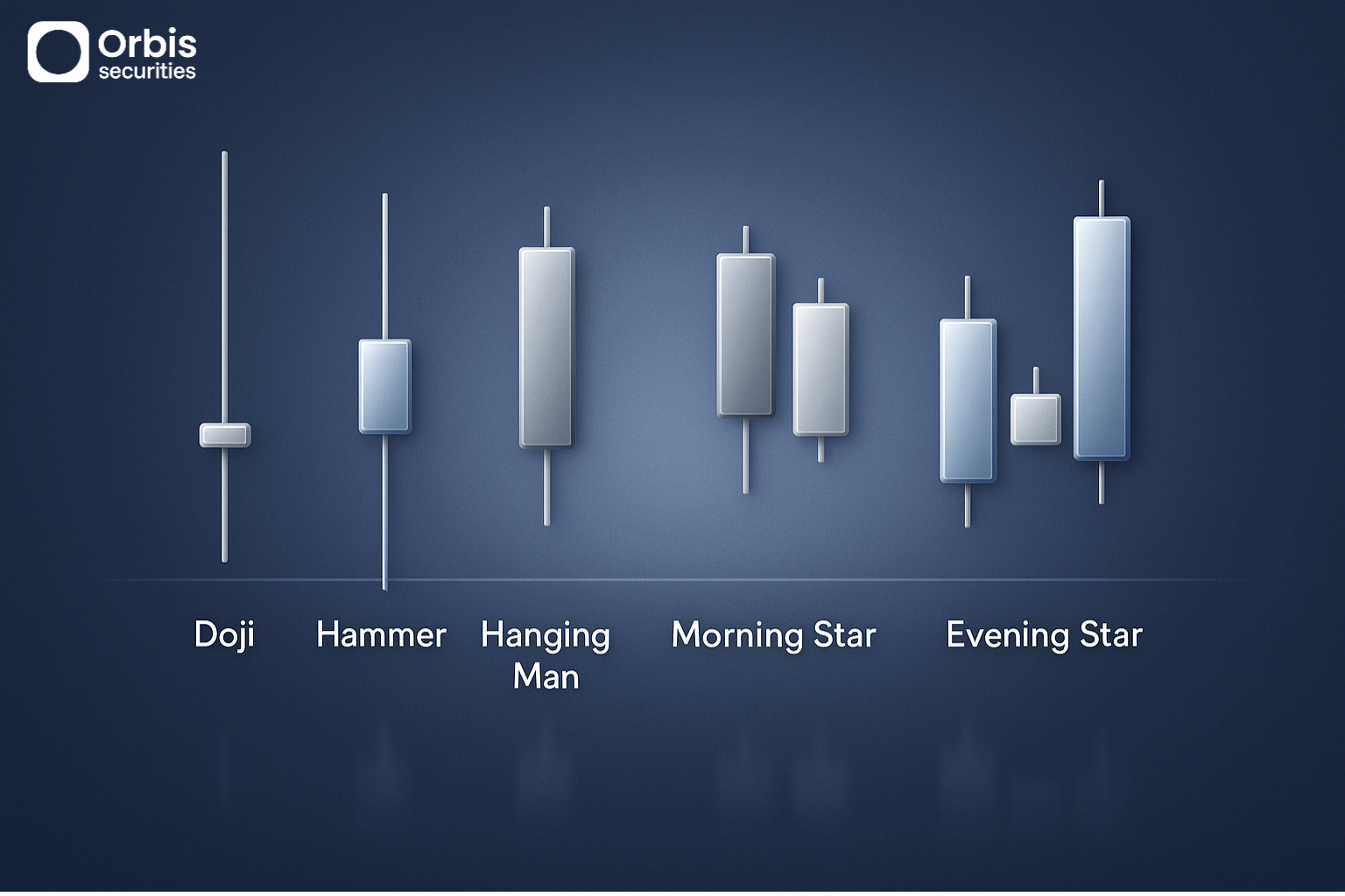
For example, when a candlestick closes with the open and close at nearly the same level, it reflects a balance between buyers and sellers, indicating market indecision.
This type of structure can signal that the current trend is weakening.
If a candlestick with a long lower wick appears during a downtrend, it suggests that strong selling pressure was present but ultimately overpowered by buyers pushing the price higher.
This can indicate weakening bearish pressure and may signal a potential rebound.
Conversely, if a similar pattern appears at the top of an uptrend, it may suggest that selling pressure is increasing.
While the price may appear to continue rising, the internal balance of power is already shifting.
🔹 Reversal Signals from Multiple Candles
Candlesticks carry meaning individually, but when combined, they form clearer patterns.
For example, after a downtrend, a short period of consolidation followed by a strong bullish candle often indicates a shift in control from sellers to buyers—this is a classic reversal pattern.
On the other hand, after an uptrend, if the market pauses briefly and then forms a strong bearish candle, it can signal that the uptrend has ended and selling pressure is taking control.
These patterns represent not just price movement, but a step-by-step transition in market sentiment.
🔹 Key Principles for Interpreting Candles
Candlestick patterns should not be judged by shape alone—they must always be interpreted within context.
The same pattern can have completely different meanings depending on whether it appears at the top of an uptrend or the bottom of a downtrend.
It is also important to confirm patterns with trading volume.
If volume increases when a pattern forms, it suggests that real market participation is supporting the move, increasing its reliability.
Conversely, if volume does not support the pattern, it may simply reflect short-term volatility rather than a meaningful signal.